

If your real estate investing website is getting traffic but not enough leads, the problem usually isn’t your traffic source. It’s your call to action.
You can have the best headline, the most compelling copy, and a beautifully designed page, but if you don’t have Calls to Action tips that convert Motivated Sellers visitors to act motivated sellers into real leads, none of that matters.
This is one of the most overlooked areas in real estate investor marketing. Investors pour money into ads, SEO, and content, then place a generic “Contact Us” button at the bottom of the page and wonder why conversions stay flat. Motivated sellers, by definition, are already dealing with stress.
They’re facing foreclosure, inherited property, divorce, or a house they simply can’t sell the traditional way. Your call to action is the bridge between their problem and your solution. If that bridge feels weak, confusing, or untrustworthy, they’ll leave and call someone else.
In this article, we’ll walk you through the calls to action tips that convert motivated sellers into real leads, why each one matters, and how to apply them to your website today.
What is a Call to Action And Why It Matters More Than You Think
A call to action, or CTA, is the specific instruction that tells a visitor what to do next. “Get My Cash Offer,” “Request a Free Consultation,” or “See What Your House Is Worth” are all examples.
It sounds simple, but the wording, placement, design, and psychology behind it can be the difference between a five percent conversion rate and a fifteen percent one.
Motivated sellers are not casual browsers. They’re often searching under pressure, comparing multiple investor websites in a short window of time.
A strong CTA reduces friction and answers the unspoken question every visitor has: “What happens if I click this?” When that question is answered clearly and confidently, visitors convert. When it isn’t, they bounce.
This is why understanding how to get a better CTA to convert website visitors isn’t just a design decision. It’s a revenue decision.
The Top 10 Best Calls to Action Tips That Convert
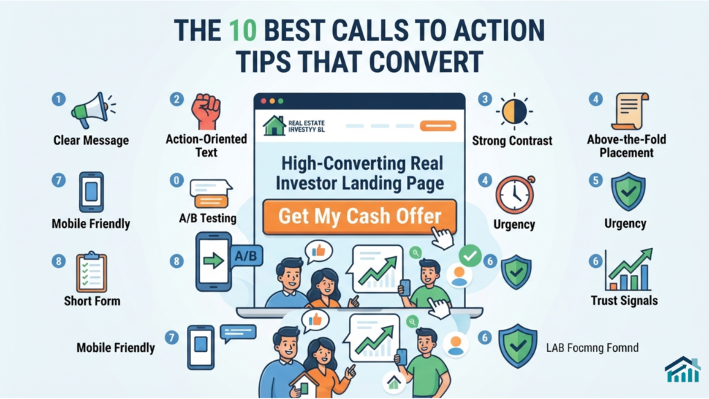
#1. Lead With the Seller’s Outcome, Not Your Process
Sellers don’t care that you “buy houses in any condition using a proprietary process.” They care about what happens to them. Instead of “Submit Property Information,” try “Get Your Fair Cash Offer in 24 Hours.” The outcome should be front and center, not the mechanics behind it.
#2. Use Action-Oriented, First-Person Language
Buttons that use first-person phrasing tend to outperform generic ones. “Get My Offer” often converts better than “Get Your Offer” because it feels personal and immediate, like the visitor is speaking for themselves. Test both, but don’t underestimate this small shift in psychology.
#3. Keep It Short and Specific
A CTA should be scannable in under two seconds. Avoid vague phrases like “Learn More” or “Click Here.” These tell the visitor nothing about the value on the other side of the click. Specific CTAs such as “See My Cash Offer Now” set clear expectations and reduce hesitation.
#4. Place Your CTA Above the Fold
Visitors shouldn’t have to scroll to find out how to contact you. Your primary calls to action should appear within the first screen a visitor sees, ideally paired with a short, benefit-driven headline.
This single change is one of the fastest ways to improve how a call to action converts website visitors browsing on mobile devices, where attention spans are even shorter.
#5. Repeat Your CTA Strategically Throughout the Page
One call to action at the top isn’t enough for longer pages. As visitors scroll and read testimonials, FAQs, or process explanations, they should always have an easy way to act. Place a CTA after your value proposition, after your testimonials, and again near the footer.
#6. Reduce the Perceived Effort
Every additional form field is a reason for a motivated seller to abandon the page. Instead of asking for a full property history upfront, start with just an address and phone number.
You can gather more details in a follow-up call. Lowering the perceived effort increases completion rates significantly.
#7. Add Urgency Without Sounding Pushy
Phrases like “Get Your Offer Before the Weekend” or “Limited Availability This Month” can nudge hesitant sellers to act now instead of later. The key is keeping urgency honest and relevant to their situation, not manufactured or exaggerated.
#8. Use Color and Contrast Intentionally
Your CTA button should visually stand out from the rest of the page. If your site uses blue and white throughout, a bright orange or green button will naturally draw the eye. This isn’t about flashy design. It’s about guiding attention to the one action that matters most.
#9. Build Trust Directly Beside the CTA
Motivated sellers are often wary of scams, especially in the cash home-buying space. Placing trust signals like “No Obligation,” “No Fees,” or “BBB Accredited” directly next to your CTA can ease hesitation at the exact moment a decision is being made.
#10. Match the CTA to the Stage of the Buyer Journey
Not every visitor is ready to submit their address. Some are still researching their options. Offering a secondary, lower-commitment call to action such as “See How Our Process Works” alongside your primary offer captures leads who aren’t ready to convert immediately but may return later.
Step-by-Step Guidance to Improve Your CTA Today

#1. Audit your homepage and landing pages. Identify every CTA currently in use and where it’s placed.
#2. Rewrite each call to action using outcome-focused, first-person language.
#3. Move your primary CTA above the fold if it isn’t already there.
#4. Shorten your lead capture form to the essential fields only.
#5. Add one trust signal directly beside your main calls to action.
#6. Test two versions of your button color and copy using a simple A/B split.
#7. Track conversion rate changes over a two- to four-week period before making further adjustments.
This process alone often reveals quick wins that don’t require a full website redesign, just smarter placement and messaging.
Common Mistakes Investors Make With Their CTAs
Many real estate investor websites make the same avoidable errors. Generic language like “Submit” or “Learn More” fails to communicate value.
Long, complicated forms scare off sellers who are already overwhelmed. Some sites bury their CTA below several paragraphs of company history that the visitor never asked for.
Another common mistake is using too many competing CTAs on one page. When a visitor sees five different buttons asking for five different actions, they often choose none of them. Clarity and focus consistently outperform variety.
Finally, many investors set up their CTA once and never revisit it. Seller behavior, search intent, and even mobile browsing habits shift over time. A CTA that performed well two years ago may be underperforming today simply because it was never tested again.
Expert CTA Tips for Advanced Optimization
Once the fundamentals are in place, a few advanced tactics can push conversion rates even higher. Consider using exit-intent popups that offer a simplified version of your calls to action to visitors who are about to leave the page without converting.
Heatmap tools can show you exactly where visitors are clicking, scrolling, and losing interest, giving you data-driven insight instead of guesswork.
It also helps to write CTA copy that speaks directly to specific seller situations. A visitor dealing with an inherited property has different concerns than someone facing foreclosure.
Where possible, create separate landing pages with tailored CTAs for each scenario rather than relying on one generic offer for every visitor.
Real World Application
Consider a real estate investor whose homepage originally featured a plain “Contact Us” button with no supporting copy. After rewriting the CTA to “Get My No Obligation Cash Offer,” adding a short three-field form, and placing a trust badge beside the button, the site saw a measurable increase in form completions within the first month.
No new traffic source was added. The only change was how the existing traffic was guided to act.
This is the core idea behind every best CTA real estate investor website should apply. Traffic without conversion is a wasted opportunity. Small, deliberate changes to your calls to action strategy consistently produce better results than chasing more visitors alone.
How Reirank.com Can Help You.
Improving your calls to action is a strong first step, but it works best as part of a complete digital strategy. At Reirank.com, we specialize in helping real estate investors turn website visitors into motivated seller leads through SEO, conversion-focused website design, and targeted digital marketing built specifically for the REI industry.
If your website isn’t converting the way it should, the issue may go beyond just your CTA. It could involve site structure, messaging, or how well your pages are optimized to capture search intent from motivated sellers actively looking for a solution.
Visit our services page to see how Reirank.com can help you build a website and marketing strategy designed to convert more visitors into real seller leads.
Conclusion: 10 Best Calls to Action Tips That Convert Motivated Sellers
Getting more motivated seller leads doesn’t always mean spending more on ads or ranking higher on Google. Often, the fastest path to more conversions is right in front of you, in the words and placement of your call to action.
Applying these calls to action tips that convert, from outcome-focused language to strategic placement and trust building, can transform a website that generates traffic into one that generates real, qualified seller leads.
ALSO READ: 10 Proven Ways Reviews Improve Local SEO for REI
The investors who consistently outperform their competitors aren’t always the ones with the biggest marketing budgets. They’re the ones who understand how to guide a visitor from curiosity to action with clarity and confidence.